

WordPress CDN: What It Does and When You Need One
Sometimes a WordPress site is slow, but not for everyone. It loads fine for you. Then a customer in another country says the images take forever. A speed test from your city looks…
Read

WordPress performance can suffer when images are too large, use the wrong format, or load at the wrong time. WordPress image optimisation helps by reducing image data, serving the right size and format, and loading each image when visitors need it.
Done properly, it creates faster pages without blurry photos, missing product details, or content that jumps as images appear. This guide will show you how to keep WordPress’s responsive image features, delay images below the visible area, and let the main image load early.
If an image is slowing down an important page or failing to appear, you’ll also learn how to fix the problem without changing settings across your entire site.
TL;DR: Resize oversized images and compress them for their purpose. Use WebP or AVIF with a fallback when your setup supports it. For bulk processing, compare WordPress image optimisation plugins or use AirLift to manage image compression, caching, and CDN delivery under a single setup.
Start with the page that brings traffic, leads, or sales. Find its largest visible image and check the file the browser actually downloads. This is usually more useful than processing an entire Media Library without knowing what is slowing the page.
Images often affect Largest Contentful Paint (LCP), the time it takes for the main visible image or block to appear. On a blog, this may be the featured image. On a shop, it may be the main product image.
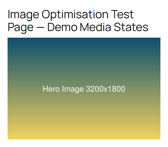
To improve LCP on WordPress, start with that image rather than changing every setting on the site. Use this short workflow:
📝 Note: A fast desktop test can hide a problem on a phone. Check both when the page matters to mobile visitors.
The next decision is usually size. Compression cannot make an image efficient if the file contains far more pixels than the page can display.
Resizing and compression do different jobs. Resizing changes an image’s pixel dimensions. Compression reduces the data needed to store those pixels. When an original is much larger than its display area, resize it first, then compress it.
For a content area 800 pixels wide, an image around 1200 to 1600 pixels wide is often enough for a sharp display on high-density screens, which pack more pixels into the same space. Full-width banners, product galleries, and images that need zooming may need more. Small thumbnails need less.
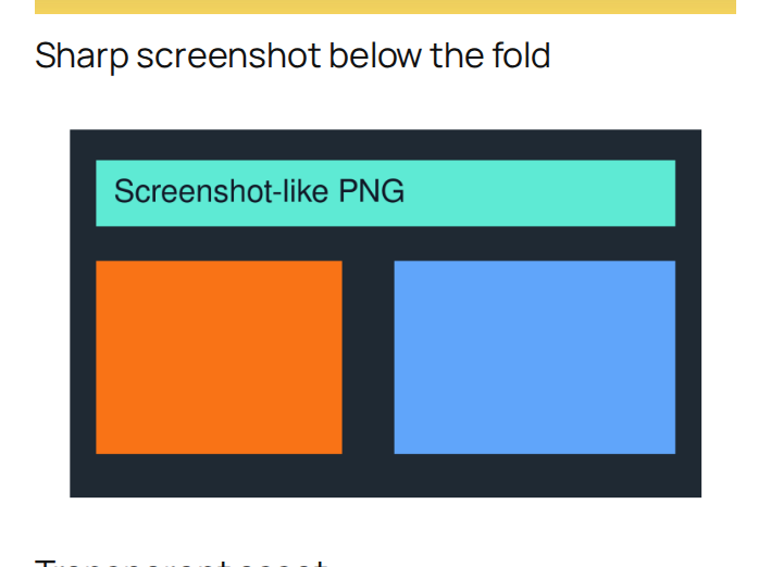
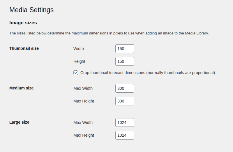
WordPress helps with oversized uploads, but it does not finish the whole job. In a fresh WordPress test with no image optimisation plugin active, uploading a 3200 x 1800 JPEG produced a 2560 x 1440 scaled image and smaller versions at 2048, 1536, 1024, 768, 300, and 150 pixels wide. A 1600 x 1000 PNG produced 1536, 1024, 768, 300, and 150 pixel versions. A 900 x 900 transparent PNG produced 768, 300, and 150 pixel versions.

Those generated files help WordPress serve a closer match to the display size, but they do not replace compression or modern-format conversion. The original upload can still use storage and processing time, and a theme or page builder can request a file that is too large for the visible space.
WordPress normally gives the browser a selection of image widths and a hint about the image’s display width. The browser can then choose a smaller file for a phone instead of downloading the desktop-sized file.
In the test page, image tags included width and height values, plus srcset, a list of available image files, and sizes, a hint about how wide the image would appear. This is useful only if the theme, page builder, or custom block leaves those instructions intact. Check the finished page, not only the Media Library:
Do not replace a normal image with a background image just to control its position. Background images often need separate sizing and loading rules, which makes them easier to get wrong.
There is no best format for every image. Choose it based on the image’s purpose and check the result at its real display size.
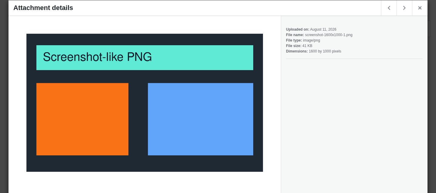
Compression also has choices. Lossy compression removes some image data for a larger size reduction. Lossless compression preserves the data but usually saves less space. A moderate lossy setting works for many web photos, while screenshots, product images, charts, diagrams, and portfolio work need a visual check.
📝 Note: The best target is the smallest file that still serves the image’s purpose. A higher compression percentage is not automatically a faster or better result.
The format and quality are only half of delivery. The page must also decide which images should load immediately.
Lazy loading delays an image until the visitor is close to it. It helps long articles, galleries, product grids, and archives with many images below the visible area.

Do not lazy-load the hero, featured, or main product image when it is the LCP image. That image should start loading early. In the WordPress test, the featured image received high loading priority and was not lazy-loaded. A later transparent PNG was lazy-loaded.
⚠️ Note: If a speed tool says to lazy-load every image, check which image is the main visible element before applying that advice.
Keep image width and height values so the browser knows the image’s shape before it loads. This helps prevent Cumulative Layout Shift (CLS), the unexpected movement of page content while images, ads, or embeds appear.
These values describe the image’s shape. They do not stop the image from shrinking on a phone. Reserving this space helps prevent layout shifts so you do not see a Core Web Vitals assessment failed error in PageSpeed Insights.
An established site needs a repair plan for existing images and a publishing rule for new ones.
A CDN, or content delivery network, serves files from locations closer to visitors. Adaptive delivery can also send a smaller image to a phone than to a large desktop screen. These options can help global audiences, image-heavy shops, and high-traffic sites, but they add another service and another layer to test.
Local processing uses hosting resources. Cloud processing can reduce that load, but it may add quotas, bandwidth limits, another account, and dependence on a third party. Choose the trade-off that fits the site’s traffic, hosting capacity, and publishing workflow.
Give each performance task one clear owner. A plugin, an add-on that extends WordPress, or a service can handle bulk processing, modern formats, backups, lazy loading, caching, or CDN delivery. Problems begin when several tools handle the same task.
Two image optimisation tools can work together when their responsibilities are separate and the final page is checked. More tools do not guarantee a better result.
Record a baseline before changing the image, then measure website speed using the same URL, device, location, and network settings when possible. Record the main image, its file size and format, LCP, total image data, request count, and visual quality.
Performance scores can change because of network conditions, server load, cache state, test location, and the delay before real visitor data updates. Use the score with the page’s actual loading behaviour, not as the only verdict.
If image changes do not help, inspect the server, saved page delivery, page styles, scripts, font file size, hosting, third-party services, and theme or plugin overhead. Compressing a logo will not fix a slow server or a delayed page style file.
Image optimisation is one part of WordPress performance optimization. If you do not want separate tools managing images, caching, CDN delivery, page styles, scripts, and fonts, AirLift is a broader performance option to consider.
AirLift is most relevant when you need to:
AirLift brings those areas together with image optimisation and optimization settings aimed at Core Web Vitals, which measure loading speed, response to interaction, and visual stability. It does not remove the need to choose sensible image dimensions or check important pages after a change. Keep the main visible image out of lazy loading when it is the LCP element, then test the result on the real site.
It is the process of reducing image data, choosing suitable dimensions and formats, and controlling when images load. The goal is faster pages without visible damage or unstable layouts.
Yes, when the original is much larger than its display area. A useful starting point is 1.5 to 2 times the content area’s width, with more room for images that need full-width display or zooming.
Use JPEG for photos, PNG for transparency and sharp graphics, WebP for a practical modern option, and AVIF when testing shows a benefit and your setup provides a reliable fallback. The image’s purpose matters more than the format name.
No. Lazy-load images below the visible area, but let the hero, featured, or main product image load early when it is the main visible element. Delaying it can make LCP worse.
Not always. Careful resizing and compression may be enough for a small site. A plugin or service becomes useful when you need bulk processing, automatic uploads, modern formats, backups, adaptive delivery, or consistent settings for several editors.
Good WordPress image optimisation starts with the image that slows an important page. Resize it to a sensible display size, compress it for its image type, use a suitable modern format when practical, preserve responsive image choices, and keep the main visible image out of lazy loading.
Then measure the same page again. If images are no longer the bottleneck, move to caching, delivery, page styles, scripts, fonts, hosting, or other causes instead of compressing harder. For the broader troubleshooting path, see slow-loading WordPress diagnosis. This focused workflow keeps pages fast, visuals useful, and future uploads easier to manage.If you run a shop with heavy product galleries, see our guide on Ecommerce website performance to optimize high-traffic store pages.
Sometimes a WordPress site is slow, but not for everyone. It loads fine for you. Then a customer in another country says the images take forever. A speed test from your city looks…
Read

If a WordPress performance audit has told you to “enable lazy loading,” you may be wondering what to change first, especially if your site already uses a lazy-loading plugin. Lazy…
Read

Is your WordPress website loading slowly, but you are not sure what is causing the problem? Changing plugins, hosting, themes, or cache settings without clear evidence can waste…
Read
Airlift works out what each page needs and applies it. Free to try on your own site.